


Using the Image‑Filter module and srcset tag to resize images on the fly
Responsive web design has become the norm for modern websites and web applications, providing a consistent experience across a wide variety of devices while also optimizing the display for each device. However, modern devices vary not only in terms of screen size but also pixel density. The HTML5 img tag provides a number of features that enable the browser to select the most appropriate asset if the server provides multiple variants. If the website deploys multiple different sizes of the same image, the web browser can choose the size best suited to its current environment.
Responsive images can therefore allow the web browser to produce a rendering that closely matches the intent of the designer. This improves user experience but it also puts an additional burden on the development and operations teams, who now have to create and deploy numerous image asset variants as well as the default image.
In this blog post we show how to use the Image‑Filter module for NGINX and NGINX Plus to deliver responsive images without the headache of creating and managing a myriad of image asset variants – instead, we can deploy a single “source” version of each image that NGINX or NGINX Plus resizes on the fly. The information in the post applies to both NGINX Open Source and NGINX Plus (except for the separate instructions in Installing the Image‑Filter Module); for brevity, we refer to NGINX Plus throughout.
The srcset Attribute
The principal tool for delivering responsive images is the srcset attribute of the HTML5 img tag. We can use it to specify a number of image asset variants for different pixel densities and viewport sizes. Viewport is a generic term for the display space available to the web browser, whether it’s in a window on a desktop or a full‑screen app on a mobile device.
In the following example, the src attribute defines a default image for browsers that do not support the srcset attribute and the srcset attribute names two variants – one for displays with standard pixel density (1x), and a second for displays with double pixel density, such as Apple Retina™ displays and some 4K monitors (2x).
<img src="/images/mylogo-default.png"
  srcset="/images/mylogo-density1.png 1x, /images/mylogo-density2.png 2x">
The following more sophisticated example defines a number of image asset variants to display, according to the width of the viewport. The sizes attribute specifies that the browser renders an image in one‑half of the viewport if the viewport is wider than 10em and uses the entire viewport otherwise. The browser determines how much space is available for the image, and selects the image asset variant that best fits the available space, typically “rounding up” to the next width (w suffix) and internally resizing the image to fill the space exactly.
<img src="/images/racecar-default.jpg"
  sizes="(min-width: 10em) 50vw, 100vw"
  srcset="/images/racecar-100px.jpg 100w, /images/racecar-225px.jpg 225w,
          /images/racecar-450px.jpg 450w, /images/racecar-675px.jpg 675w">
This approach to delivering responsive images by specifying a range of image asset variants is easy to code and highly effective. However, it presents challenges in terms of creating and managing the image variants themselves. You have to do a great deal of pre‑production image resizing and deploy a much greater number of files on the server. It can be time‑consuming to fine‑tune the optimum number and size of each variant, which then leads to difficulty in testing that each image asset variant is accessible.
For more information about the srcset attribute and other techniques for responsive images, see this great blog post.
Installing the Image‑Filter Module
The procedure for obtaining that Image‑Filter module differs for NGINX Plus and NGINX.
Installing the Image‑Filter Module for NGINX Plus
The Image‑Filter module is available as a free dynamic module for NGINX Plus subscribers.
-
Obtain the module itself by installing it from the NGINX Plus repository.
For Ubuntu and Debian systems:
$ sudo apt-get install nginx-plus-module-image-filterFor RedHat, CentOS, and Oracle Linux systems:
$ sudo yum install nginx-plus-module-image-filter -
Enable the module by including a
load_moduledirective for it in the top‑level (“main”) context of the nginx.conf configuration file (that is, not in thehttporstreamcontexts).load_module modules/ngx_http_image_filter_module.so; -
Reload NGINX Plus to load the Image‑Filter module into the running instance.
$ sudo nginx -s reload>
Installing the Image‑Filter Module for NGINX Open Source
The easiest way to install the Image‑Filter module is to obtain it from the official NGINX repository. Follow these instructions to configure your system to access the official NGINX repository and then install it with your operating system package manager.
For Ubuntu and Debian systems:
$ sudo apt-get install nginx-module-image-filterFor Red Hat, CentOS, and Oracle Linux systems:
$ sudo yum install nginx-module-image-filterOnce installed, follow Steps 2 and 3 in Installing the Image‑Filter Module for NGINX Plus to configure NGINX and reload.
It is also possible to compile the Image‑Filter module from source and load it as either a statically compiled or dynamic module. For details, see the NGINX Plus Admin Guide.
Matching Image Size to Pixel Density
With the Image‑Filter module, we can create and deploy a single “source” version of each image and have NGINX Plus resize it on the fly to deliver any size variants requested by the browser. We can fine‑tune responsive web pages and images entirely within the HTML source, without manually resizing and deploying images to our web server.
In this sample HTML file, we define four image variants for devices with different pixel densities.
<!DOCTYPE html>
<html>
<head>
<title>Responsive Logo</title>
</head>
<body>

<h2>Logo selection based on pixel density</h2>

<img src="/img400/mylogo.png"
  srcset="/img400/mylogo.png 1x, /img800/mylogo.png 2x, /img1200/mylogo.png 3x,
          /img1600/mylogo.png 4x">

</body>
</html>
The /img400, /img800, /img1200, and /img1600 directories do not actually exist. Instead, the following NGINX Plus configuration matches requests for assets prefixed with /img and transforms them into requests to resize the image in the original filename (for example, mylogo.png in the preceding HTML).
server {
    listen 80;
    root /var/www/public_html;

    location ~ ^/img([0-9]+)(?:/(.*))?$ {
        alias /var/www/source_images/$2;
        image_filter_buffer 10M;
        image_filter resize $1 -;
    }
}
The server block defines how NGINX Plus handles incoming HTTP requests. The listen directive tells NGINX Plus to listen on port 80 – the default for HTTP traffic. The root directive specifies the location on disk of this website. In this simple example we are using a static website hosted by NGINX Plus, but it is also common for NGINX Plus to act as a reverse proxy for dynamic content or an application connector such as FastCGI. All of these use cases can take advantage of the Image‑Filter module as described here by deploying the source images to the NGINX Plus server.
The location block uses a regular expression to match requests for assets stored in any directory that starts with /img followed by one or more digits. The digits are captured as variable $1 and the filename that follows is captured as variable $2. We then use the alias directive to serve this request from the directory on disk that contains our source images. Note that this directory is not under the root path, so clients cannot request the source images directly.
As our source images are likely to be very large, perhaps thousands of pixels wide, we need to make sure that the Image‑Filter module allocates enough memory to load and resize them. In this example we use the image_filter_buffer directive to support image files of up to 10 MB in size.
Finally, the image_filter directive tells the Image‑Filter module to resize the source image to the width captured from the suffix of the /img directory name. The dash (‑) tells NGINX Plus to maintain the source image’s aspect ratio.
Considerations for Production Use
The configuration described in Matching Image Size to Pixel Density can deliver any size variant of an image depending on the directory name used to request the image. However, for a production environment we don’t want to wait for the web server to resize images for each request. That is not good for overall latency and can also add significant CPU overhead.
The most effective solution is to cache our resized image variants so that subsequent requests for each variant are served from the cache, without going through the Image‑Filter module. We can achieve this with NGINX Plus configuration by defining a separate virtual server that performs image resizing, and proxy requests to it only if the requested image size is not already in the cache. We call this the responsive image server.
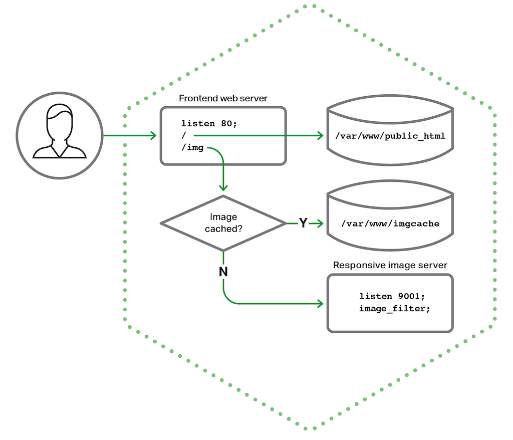
We must also consider the security implications of allowing arbitrary requests to perform image resize operations. Having caching configured does not help if an attacker were to make rapid requests to unique image asset variants such as /img1001/mylogo.png, /img1002/mylogo.png, /img1003/mylogo.png and so on. Even with a relatively low volume of requests, such attacks may cause denial of service (DoS) because of excessive CPU utilization. To address this, we apply a rate limit to the responsive image server, but not to the frontend server containing the cached variants. The following configuration extends the configuration in Matching Image Size to Pixel Density by applying caching and rate limiting to the Image‑Filter module.
proxy_cache_path /var/www/imgcache levels=1 keys_zone=resized:1m max_size=256m;

server {
    listen 80;
    root /var/www/public_html;

    location ~ ^/img([0-9]+)(?:/(.*))?$ {
        proxy_pass        http://127.0.0.1:9001;
        proxy_cache       resized;
        proxy_cache_valid 180m;
    }
}

limit_req_zone "1" zone=2persec:32k rate=2r/s;

server {
    listen 9001;
    allow 127.0.0.1;
    deny all;
    limit_req zone=2persec burst=10;

    location ~ ^/img([0-9]+)(?:/(.*))?$ {
        alias /var/www/source_images/$2;
        image_filter_buffer 10M;
        image_filter resize $1 -;
    }
}
We start by defining the location of our cached images with the proxy_cache_path directive. The keys_zone parameter defines a shared memory zone for the cache index (called resized) and allocates 1 MB, which is sufficient for about 8,000 resized images. The max_size parameter defines the point at which NGINX Plus starts to remove the least recently requested images from the cache to make room for new cached items.
The location directive for the frontend web server (the one listening on port 80) uses the proxy_pass directive to send requests prefixed with /img to the internally hosted responsive image server (127.0.0.1:9001). The proxy_cache directive enables caching for this location by specifying the name of the cache (resized) to use to store responses from the responsive image server. The proxy_cache_valid directive ensures that resized images are kept in the cache for at least 180 minutes (unless the cache has exceeded max_size and they are among the least recently requested) and that any erroneous responses from the responsive image server are not cached.
For an in‑depth description of caching, see A Guide to Caching with NGINX and NGINX Plus.
Before defining the responsive image server itself, we specify a rate limit with the limit_req_zone directive. The directive does not itself enforce a rate limit – it defines a rate limit of two requests per second that is then applied to the responsive image server by including the limit_req directive in its server block (see the next paragraph). Typically a rate limit is keyed against an attribute of the request but in this case we specify the static key value "1" so that the limit applies to all requestors. We set the size of the shared memory zone to the smallest possible value, 3 KB, because our key has a fixed cardinality of one.
The server block for the responsive image server listens on port 9001. We include the allow and deny directives to specify that only localhost (the frontend web server) can connect to the responsive image server. We then apply the previously defined rate limit by including the limit_req directive; the burst parameter allows 10 concurrent requests before enforcing the rate limit. Once the rate limit is in effect, excess requests are delayed until they can be processed within the limit.
The location block is identical to the one in Matching Image Size to Pixel Density but is now exercised only when the requested image is not in the cache and while the rate limit has not been exceeded.
In this basic configuration, a single NGINX Plus instance acts as both the frontend web server and the responsive image server. Image processing can be very computationally intensive, potentially leading to extremely high workloads and making NGINX Plus subject to DoS attacks. To avoid the situation where the frontend web server cannot immediately accept new requests because all worker processes are busy with image‑resizing requests, we recommend running a separate NGINX Plus instance dedicated to image processing. This isolates the worker processes for the frontend web server from those doing image processing. To run a separate instance of NGINX Plus on the same host, specify a different configuration file on the command line:
$ sudo nginx -c /etc/nginx/resize-server.confResponsive Images in Action
The most effective way to see responsive images in action is to observe a browser making decisions about which srcset image variant to use as the size of the viewport changes. Here is the HTML source of a simple image gallery. Note that for demonstration purposes the size variants are slightly different for each image, creating many possible “breakpoints” at which the browser can choose a different variant.
<!DOCTYPE html>
<html>
<head>
<title>Responsive Image Gallery</title>
</head>
<body>
<h2>Responsive Image Gallery</h2>
<img src="/img100/1-dominos.jpg" sizes="(min-width: 20em) 40vw, 100vw"
srcset="/img110/1-dominos.jpg 110w, /img210/1-dominos.jpg 210w,
/img310/1-dominos.jpg 310w, /img410/1-dominos.jpg 410w,
/img510/1-dominos.jpg 510w, /img610/1-dominos.jpg 610w">
<img src="/img100/2-sign.jpg" sizes="(min-width: 20em) 40vw, 100vw"
srcset="/img120/2-sign.jpg 120w, /img220/2-sign.jpg 220w,
/img330/2-sign.jpg 330w, /img420/2-sign.jpg 420w,
/img520/2-sign.jpg 520w, /img620/2-sign.jpg 620w">
<img src="/img100/3-thruppence.jpg" sizes="(min-width: 20em) 40vw, 100vw"
srcset="/img130/3-thruppence.jpg 130w, /img230/3-thruppence.jpg 230w,
/img330/3-thruppence.jpg 330w, /img440/3-thruppence.jpg 440w,
/img550/3-thruppence.jpg 550w, /img660/3-thruppence.jpg 660w">
<img src="/img100/4-aces.jpg" sizes="(min-width: 20em) 40vw, 100vw"
srcset="/img140/4-aces.jpg 140w, /img240/4-aces.jpg 240w,
/img340/4-aces.jpg 340w, /img440/4-aces.jpg 440w,
/img540/4-aces.jpg 540w, /img640/4-aces.jpg 640w">
</body>
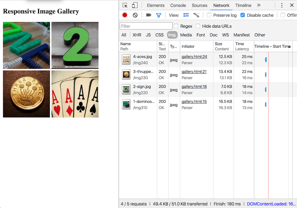
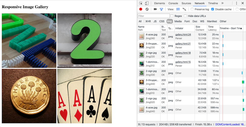
</html>The screenshots below show the contents of this web page in a Chrome browser with the Inspector open to the Network tab. The Name column shows the path of each image variant requested from the server, which allows us to see the chosen size without having to check the logs on the web server.
With the narrow viewport in Figure 2, the browser has chosen images between 220 and 310 pixels wide (the numerical suffixes on the /img directory names in the Name column range between those values).
When we widen the browser window in Figure 3, the browser chooses images between 440 and 540 pixels wide (the last four images listed). The value for these images in the Initiator column is Other.
Conclusion
With NGINX Plus and the Image‑Filter module, we can deliver the optimum image size for the current browser conditions. And we can do this without pre‑production image resizing, batch processing, or having to manage hundreds of image asset variants on disk. Just another way in which NGINX Plus helps you achieve flawless application delivery.
Try out responsive images with NGINX Plus for yourself – start your free 30-day trial today or contact us to discuss your use cases.


